
Jan 19, 2025
How I Revamped Privy’s Dashboard
My Role
Design, Conceptualisation, Research
TEAM
3 Designer, 2 Product Manager, 10 Engineers
TIMELINE
Design Handed off in Q3 2023
introduction
Revamping for the Future
In early Q2 2023, Privy launched a new product for end-users and transitioned to a new business model, shifting from a balance-based system to an annual subscription model.
With this major change, Privy needed to revamp its website and mobile app to handle business requirements and accommodate future new tech stack features—a project that was carried out soon after. Additionally, the UX and UI of Privy’s products had not been updated for quite some time. Given all these factors, we decided it was the perfect time for a full visual refresh.
the problem
Why need to revamp?
In addition to the business model and tech stack changes mentioned earlier, we received several user feedback:
Slow web-app loading and heavy browser performance
Numerous front-end display bugs
New users often felt confused during onboarding on the main dashboard page
common mistake
What went wrong with the revamp?
Beautifying the interface or following trends alone wouldn’t justify a revamp—it would waste valuable time and resources. Instead, we focused on reworking the layout and UX for meaningful improvements.
Most users, especially long-time users, may be surprised by significant changes to the UI and UX. That’s why we need to plan a smooth transition for this revamp project.
With Privy's niche in digital identity, e-signatures, and document management, finding the right UX style for the revamp was challenging.

Objective
Designing to Fit the Needs
Some key points we needed to fulfill as requirements for a complete revamp are as follows:
Need to cover the subscription model,
seamlessly transitioningfrom a balance-based system to an annual subscription model with user-friendly management features.Have
user friendlycontent and design (instead of being dashboard-centric).Need a
flexible frameworkto accommodate future feature rollouts and tech stack iterations.
With these challenges in mind, my team and I built a solid foundation to execute this dashboard revamp.
Collaborative
Design & Engineering in Action
This revamp project was handled by three designers, including myself (Giga Tetuko), Faiz Mubaroq, and Meilinda Khusnul, under the supervision of lead designer Chandra Noor.
Designing this project was a unique process, involving constant back-and-forth discussions with engineers and stakeholders to determine the best approach.
I worked closely with engineers to understand the new tech stack and its possibilities, ensuring the design aligned with technical constraints.
Insights from stakeholders played a key role in shaping the revamp strategy, allowing us to make informed, tech-driven decisions that balanced feasibility with a strong user experience.
Design process
It always starts from the clear things
This is a overview of my design process for revamping this project:
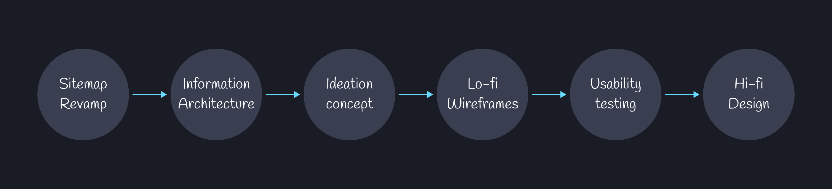
I won’t be providing the detailed sitemap and architecture information to maintain company confidentiality. However, here’s a general overview of Privy’s sitemap and architecture:
Onboarding registration
Account & Role
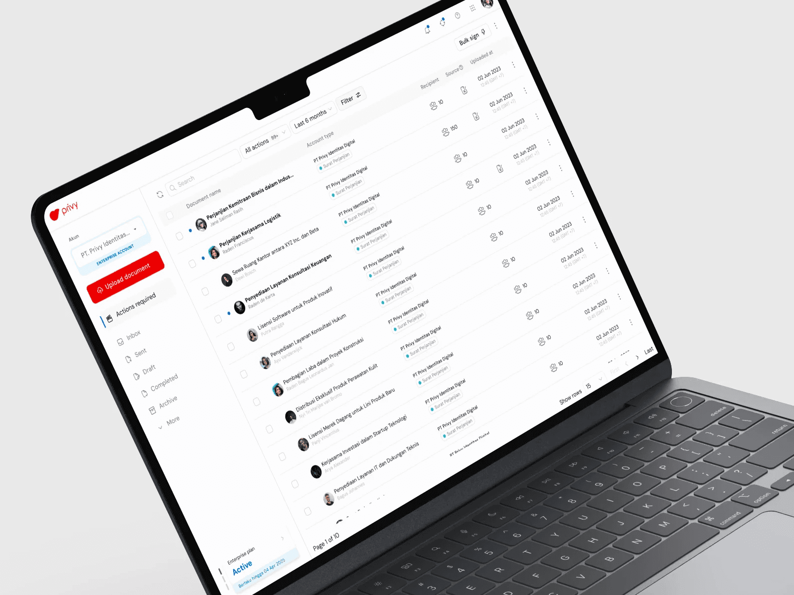
Main dashboard
Document management (list, actions & upload)
Subscription
Personalization profile
Global search
Settings & Root
From there, the list of revamp objectives we need to work on as a starting point for the design is clear. The next and most challenging step is ideation and starting the new design concept.
the ideation
Card sorting to make decisions
We conducted closed card sorting, providing predefined two UX style to five designers (including the lead designer) to determine the most suitable blueprint.
Predefined UX style concepts:
UX Minimalist Dashboard
Focus: Clean, simple, decluttered design with high visual hierarchy and emphasis on essential functions.Mimicking UX Email Services
Focus: Familiar layout similar to email inboxes, folder structures, and filters for easy document access and management.
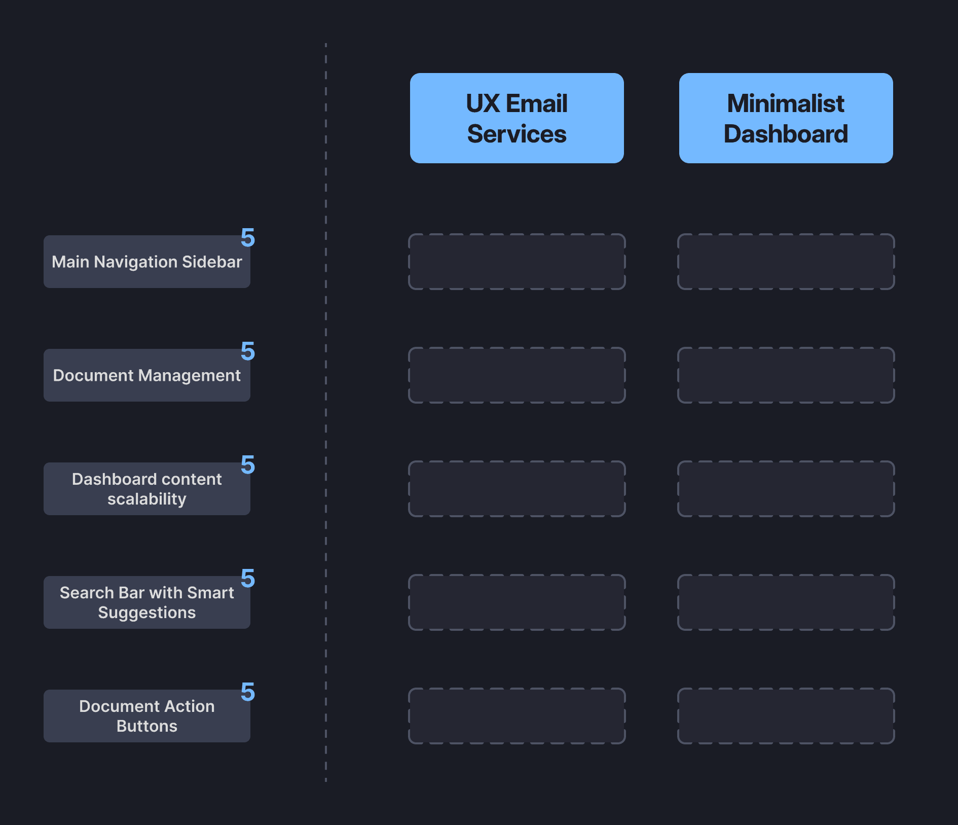
There were 5 benchmark categories for card sorting, each with 5 points representing the number of participants. The 5 designers who took part in the card sorting were: me (Giga), Faiz, Mei, Satrio Nugroho, and Chandra Noor.
They were asked to group various features of Privy's dashboard into either "UX Minimalist Dashboard" or "Mimicking UX Email Services."
Here’s a quick recap of the process—the final result of the card sorting looks like this:
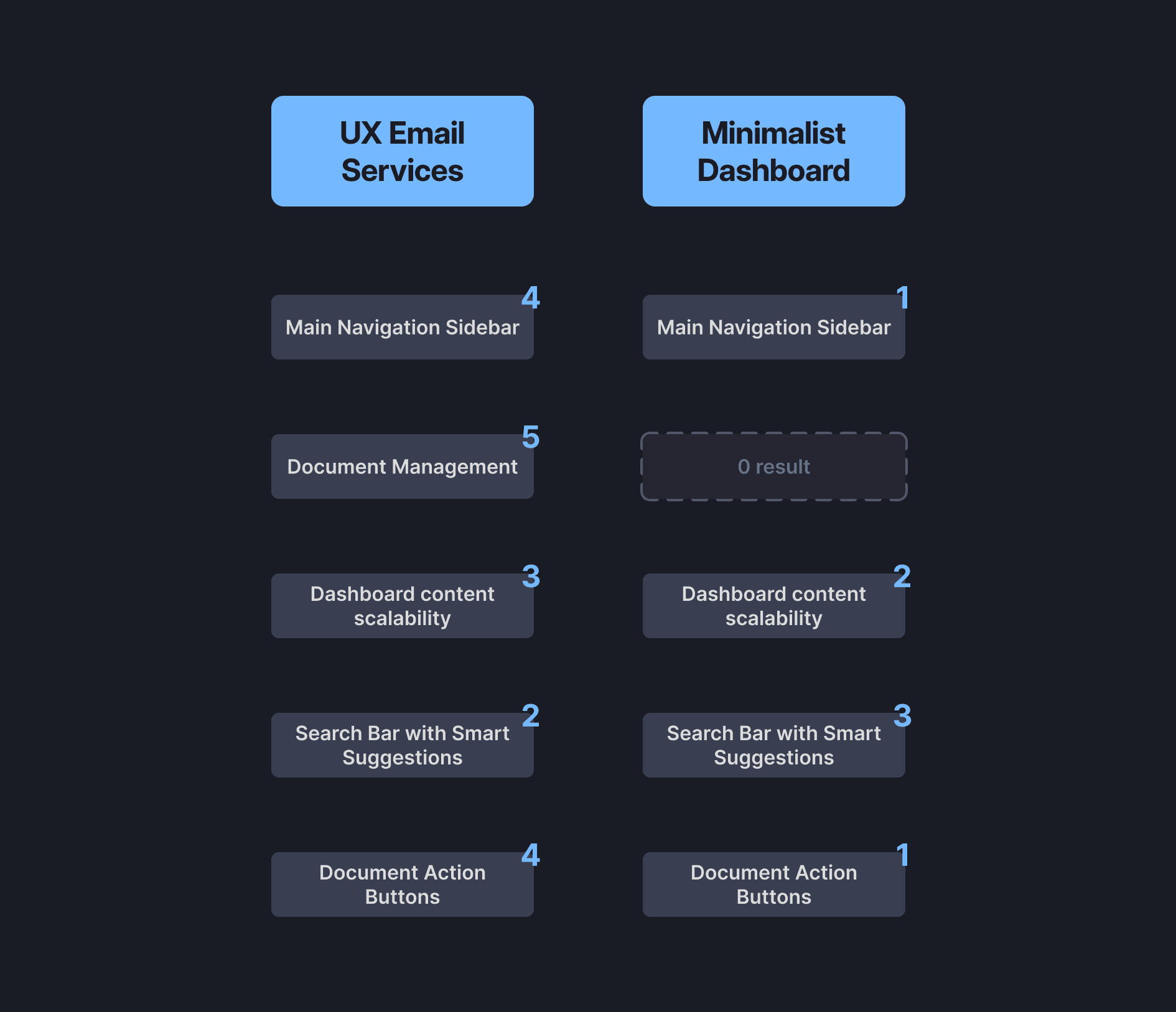
Summary of Card Sorting Results:
Minimalist Dashboard: Preferred for Smart search bar and dashboard content scalability to maintain a clean UI and streamlined future feature.
Mimicking Email Services: Strongly preferred Almost in every category, focusing on features like document management, navigation, actions and search to enhance familiarity and ease of use.
That’s how we determined the new UX design, and we decided to go with the "Mimicking UX Email Services" style.
prototype
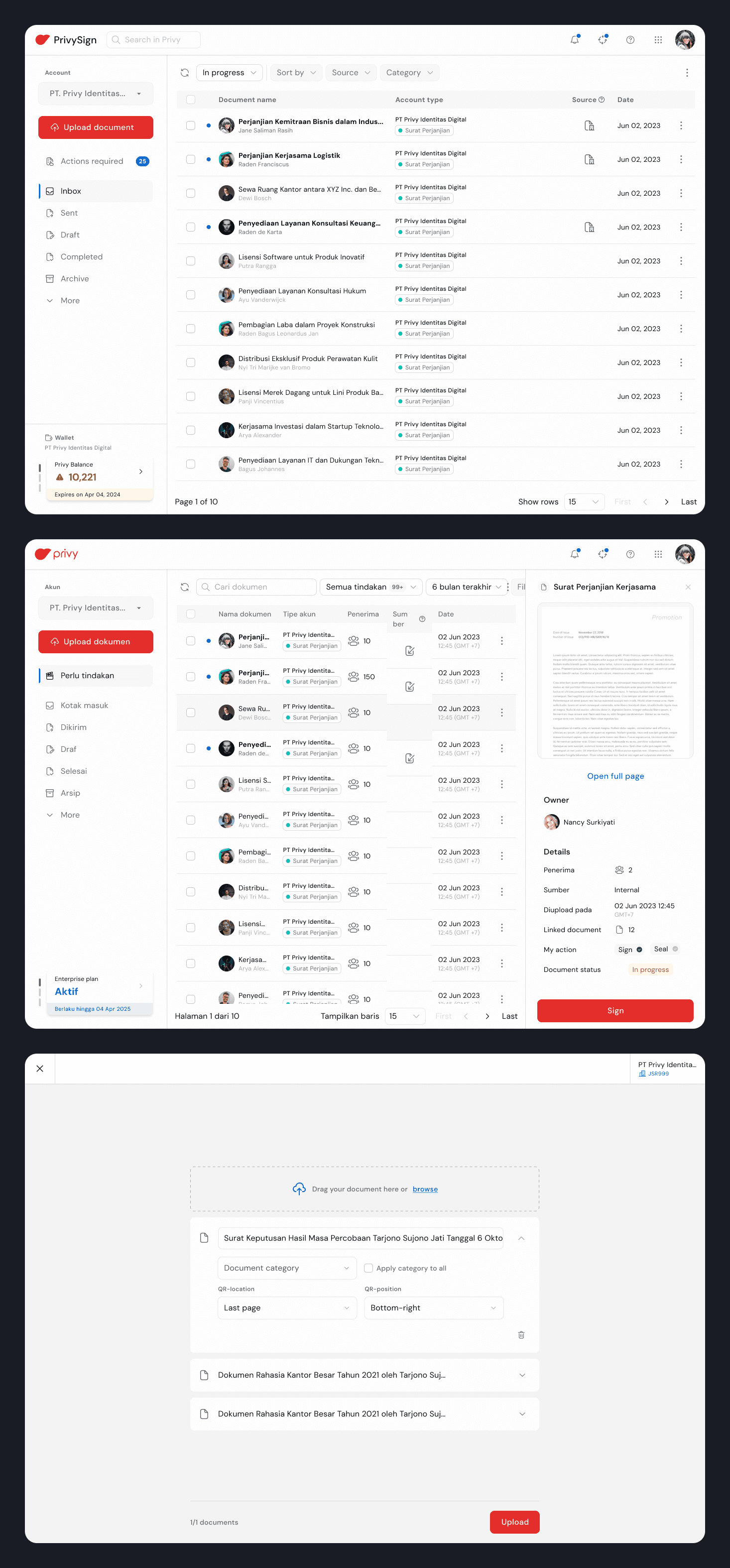
The wireframe
I’ll skip the lo-fi wireframing step because we already have a design system persona, which makes it more effective to jump straight into creating hi-fi wireframes for usability testing.
usability testing
Measuring the Impact
I assisted Wahyu Hadi in conducting usability testing for Privy’s end-users (external) and employees (internal). The testing was quantitative, using online surveys and Figma prototypes.
Usability Testing Objectives:
Understand user feelings after the revamp.
Identify challenges users face post-revamp.
Gather user likes and dislikes about the revamp.
Collect user suggestions for further improvements.
The testing results met our expectations—far from perfect, but the revamped product was generally well received. I can't share the exact numbers due to company confidentiality, but I may write a dedicated article on this research in the future.
The feedback from this testing will be a key foundation for further refinement and iterations. We also plan to validate it with a broader UX research scope.

Signing off!
Retrospective
This project was jam-packed with a lot of work, exploration and discussion with stakeholders. It feels almost impossible to boil down my learning, but if I had to, here!
Collaborating closely with engineers and stakeholders was an incredible experience. It allowed me to bring a more objective perspective, avoiding the typical designer-centric mindset while staying versatile and adaptable.